Physical Visualization: AIGA Design Census
Communications | Data Visualization | Collaboration
HOW might WE REPRESENT census DATA IN A TANGIBLE interactive FORM?
Given the 2018 (AIGA American Institute of Graphic Arts) census data from over 9,000 designers, how could we design a solution that is easy to digest and interpret? We wanted to design a tangible experience that users are able to interact with and be able to have their own interpretation of the data.
Our solution was to present the data into 50 tangible, physical cards, allowing users to interact with the data by re-arranging the cards in however way they desire in order to see correlations. This project was featured on AIGA Eye on Design as well as Kyu’s teaching site.
Role & Contribution
I worked on ideation, visuals, creation of assets, printing and assemblage.
My major contributions are:
Creation of visual assets
Ideation
Photographing of Pieces
Preparation of Cards
Set up for Final Show
Deliverables
Physical Models, Final Cards, Concept Video
Design Brief
Using the 2018 AIGA Design Census, create a way for someone to easily digest the information through a communicative design system.
Team
Susie Lee, Tiffany Lai, and Dahye Chung
PRocess
We were first given a large set of data. The AIGA Census is a yearly resource that is gathered by AIGA that helps inform the public about the current state of design as well as provide demographic information about designers. As a team, we decided that we wanted to create something that was tangible. As designers learning in this age, most, if not all, of our projects after freshman year was digital. We missed the physicality of paper, we craved to be makers. In addition, as designers, and making this data visualization for designers, we wanted to do something that would excite other makers.
Data
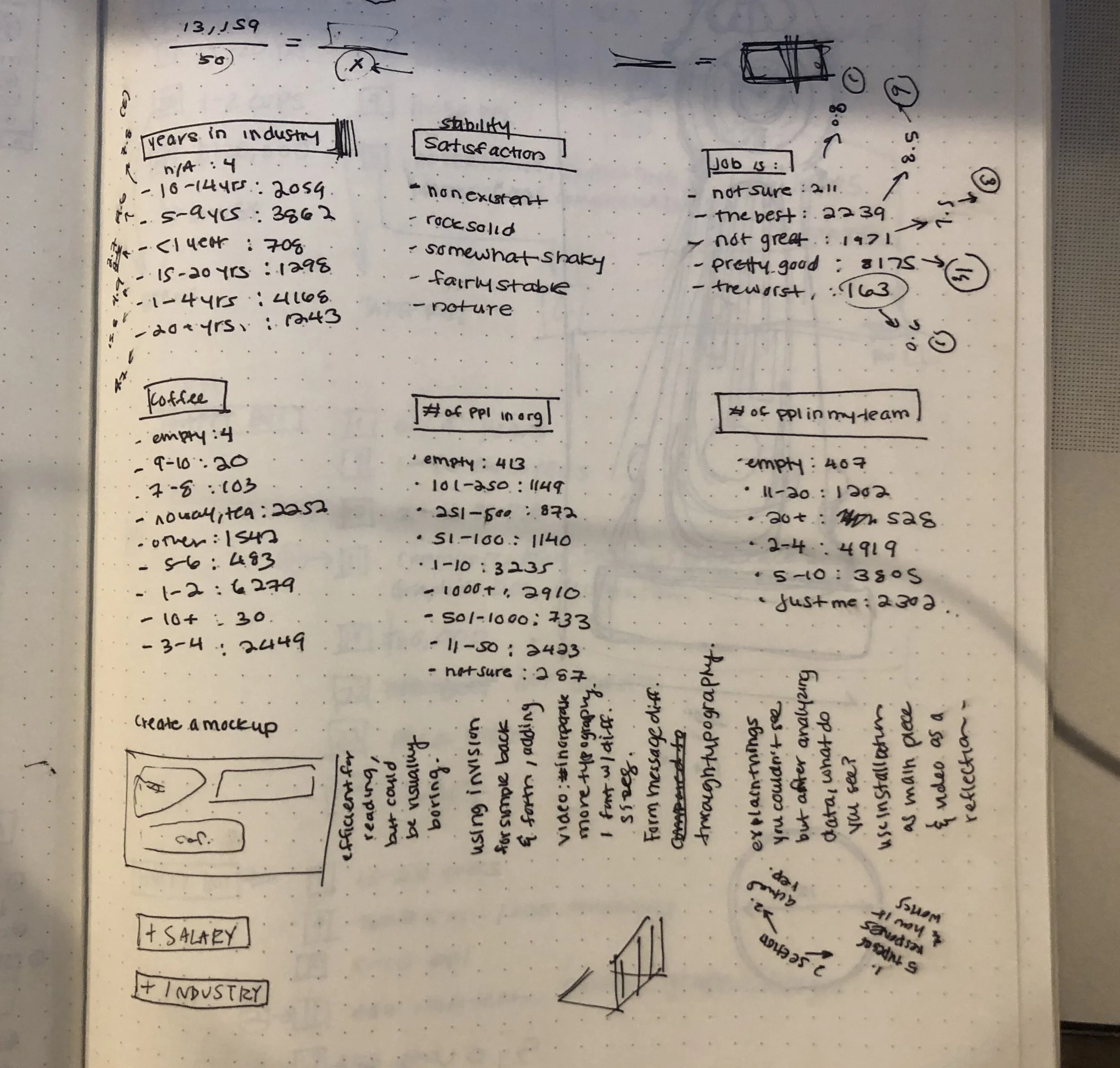
The data set was enormous. There was data about happiness levels, how many cups of coffee (or tea) the designer drank to get their creative juices flowing, and more quantitative data such as salary and how many jobs they’ve had or how large their team is. With the help of my high school friend and college roommate, Lizzy Board, we developed a python algorithm that would parse through the census data and spit out random designer’s responses. With this, we randomly selected 50 designers to represent the greater census and determined what physical form would represent the data. In addition, we selected 9 categories from the data set that we found the most interesting.
The categories were:
Happiness
Coffee
Location
Job Satisfaction
Salary
Industry
Primary Work
Number of people on their direct team
Number of people at their greater organization
However, after getting some feedback about this data set, we decided to pivot and scope. We gave our data visualization a specific audience and a purpose. This slightly altered the data categories that we would choose to include.
Our audience was design students at Carnegie Mellon. With this in mind, we wanted the data visualization to be something that is relatable to the students viewing the visualization. How does one interpret the data and how can they interpret it to be more personal given the same visualization?
We changed our categories to:
Category of work (Communications, Products, or Environments— the three concentrations CMU Design offers)
Happiness
Number of years in the industry
Number of people on their direct team
Number of people in their whole organization
Salary
Job Stability
Number of coffee (or tea) drank per day
Number of jobs they’ve had
How many hours they work in a day
A student will be able to look at this data, organize the cards in any way they’d like, and compare the categories. For example, a student could organize the cards in increasing happiness level, then see if there is a correlation between happiness and amount of coffee drank, or happiness and salary as well as, in specifics to CMU design, see if happiness and concentration (C, P, E) have any relationship.
Visual Experience
We first started this visual journey by looking into how we wanted to express the data in a physical form. We were first inspired after flipping through some of Kyuha Shim’s data visualization design books and magazines. After narrowing down the inspiration of 3D art forms, we turned to Pinterest to look into more styles.
I was also drawn to the simple way that IKEA presents its designs. Particularly, their cook book, “Fika.” This cookbook lays out all of the ingredients needed to create a dish/ recipe. We also enjoyed how they had a video supplement to the graphic visualization, which inspired us as well.
Prototype 1 + 2
Inspired by the physicality aspect, we did a version using real objects with a particular color scheme.
The first attempt, we placed real studio tools on a cutting mat. The cutting mat having measurements on it, we used that as a baseline for accuracy in data representation. However, there was nothing striking about it. Nothing more than just physical objects on top of a grid.
The second attempt, we leaned a bit more into our visual design side. Tiffany and I had this strange predilection towards, “Plants on Pink.” We took a spin and did, “Pink on Blue.” Although this was aesethically adorable, it was not successful at carrying the purpose of our visualization.
Prototype 3
From our Pinterest explorations, we enjoyed the look and feel of the designs made out of paper. As a team, we split off and made the different data elements. All elements were made using Canson mi- teintes paper (slightly thinner than card stock allowing for malleability and slightly textured similar to pastel paper). The shapes were cut out using a Cricut cutter and pieces were assembled using tacky glue.
We set up the arrangement for all 50 cards, photographed them using a Canon Rebel T-5i, touched up on Lightroom, printed on inkjet, and glued onto stuffer card stock using a spray adhesive.
Junior Communications Show
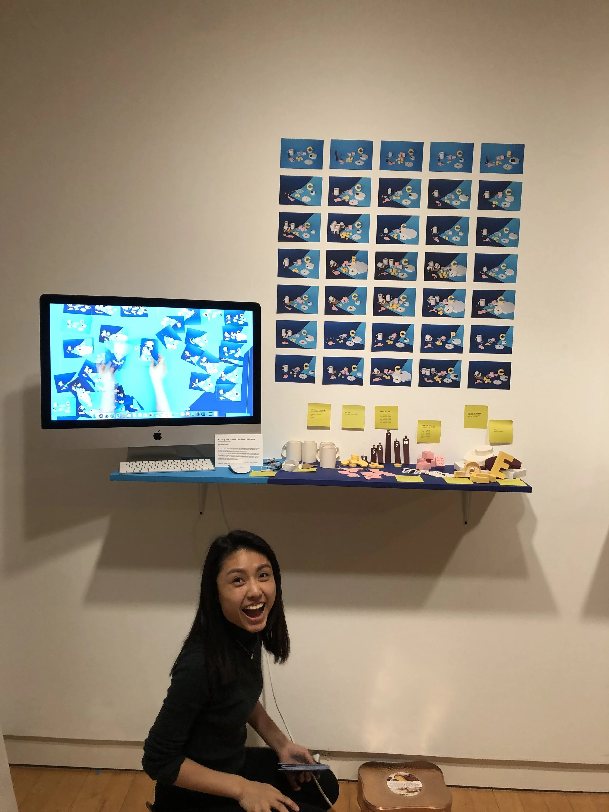
We presented this project at our junior communications final show. There, we laid out the 50 cards as well as had the physical data pieces presented on the side. We set up a camera overlooking (birds eye view) the cards using a rig composed of a tripod and a chair, recording how visitors interacted with the cards. This video was then edited to play at our Senior Show.
Senior Show
We decided to submit this project at our Senior Show. The Senior Show was a class- organzied, class- curated- class- branded, class- built week-long show that presented 3- 4 projects per student in our senior class.
We had the video from our junior communications show on a monitor, laid out our data pieces, and taped some of the cards onto the wall in increasing happiness.


