Hybrid Environments: Museum engagement (under edits)
Environments | Research | Individual
HOW CAN MILLENIALS ENGAGE WITH THE ART MUSEUM EXPERIENCE?
The culture surrounding a trip to the museum is changing. Unfortunately, a visit to the museum is becoming increasingly rare especially for millennials like us. In collaboration with Carnegie Museums , my solution is a digital app and physical space experience that will enhance one's visit while encouraging dedicated usage.
Role & Contribution
I worked on secondary research, interviews, user shadowing, on site observations, ideation, presentation.
Deliverables
Final Presentation, User Flow
Design Brief
Change/improve people’s experience in the museum environment in a meaningful way, considering a mixture of digital components in the physical world. Duration: 1 week, Fall 2016
Final Presentation PDF
Team
Individual
Process
Day 1
In 15 minutes, we had to explore the Carnegie Museum of Art app (CMOA) and wireframe the first impressions. As it was my first time wireframing, I think I need some more practice in order to get adjusted to the art of wireframing. I tried to rush through the process in order to wireframe all the app had to offer. However, not only is the quality of the drawing pretty only, but it also only scratched the surface.
Main concerns:
Map was basically a still image with the drop pin located at an ambiguous center.
When you click on it, it prompts you to open it in google maps.
The search function asks you to type in a code that refers back to a piece.
Limited number of pieces to browse through.


Day 2
Before the next studio, I took a trip to the CMOA. And that’s when the problems began to arise. Fundamentally, the app is terribly not updated. The Natural History portion was missing all but one of its exhibits and the Art Museum only had the “highlights” from its collection. The galleries mentioned no longer correlated to the current exhibition layout. There are small ads for the CMOA app, but the issue is, it is hard to locate the phone symbol. Compared to a piece of art and human, the plaque on the side is small and the phone symbol is miniscule. It was easier to notice the bright yellow indication of an honor given to the artist.
How can I “improve” this app in order for it to become more convenient for the user?
I started with deciding to improve the app for a user at home.


Initially, I started by listing what about the app inconveniences the user at home. The obvious answer would be the code that is only available at the museum on certain pieces. There needed to be a way for a different navigation route for the user at home and at site, but both entrances would lead to the same result: a page with the piece of art.
In order to make this more accessible for the user at home, I wanted to begin by getting rid of the artwork ID code business. From home, the user is able to search for particular art pieces categorized in groups such as “genre” and “time period”. When a piece is selected, the interface takes the user to a friendlier layout for viewing the work.
At the museum, users no longer need to type in a long code into their phones. Instead, through QR code, the user is able to find the work of art jiffy quick.
Day 3
On a second trip to the museum, we went through the Natural History museum first. In comparison, this museum had a much more lively attitude and the users here had no problem knowing what the “proper” way to interact with the exhibits was.
But what made the Natural History museum so much more attractive? More interactive?


From observation, there were more signage like these around the exhibits, while in the art museum, there were signs that said things like, “Do not touch”. The Natural History museum also included more hands-on activities. There was one interactive feature in the art museum that helped the visitors gain a better image of how the art work was created.


After thinking about the types of people that go to a museum and reading about some of the issues museums face, I wanted to work on the group of people that I most relate to. I enjoy going to museums, honestly. However, I have no idea how to look at art in a museum. I’m pretty clueless when it comes to what I should do in a museum setting. This app is dedicated to these people. In addition, according to this NY Times article, “the average visitor spends 15 to 30 seconds in front of a work of art.” Hopefully, this app will get the user to slow down and enjoy. After discussing ideas with Marisa and Tiffany, the app was born.
When you first enter the museum, the you are able to log in on the app and tap in at a kiosk. There, an ear piece that only works with the sensors in the museum and the app itself is distributed. You then select how much time you want/ have to spend in the museum and the app allots time for you to browse and then to really look. When you get to the gallery you want to go explore, you click “start”. The app tracks the path you take throughout the museum. When you are instinctively attracted to a piece of art, you slow down in front of it. In addition, the ear piece is able to track which direction you are facing in order to determine the art piece of interest more accurately. On the map on the app, pieces of interest are marked. When your browsing time is over, it’s time to look. The app will alert you to turn around and head towards the closest art work of interest. Rather than you having to look at a map to get to a piece, you will hear music that reflects the tone of the piece of work. When you arrive in front of the piece, you will hear narration about the work. When you look at the piece through the phone, you will see the narration (for those who are more visual learners). In addition to narration about the piece and the artist, you will be prompted to strike the pose or mimic the brush stroke. If posed, a sensor next to the piece of work takes a pic of you and when you view it through the phone, you replace the art. If brush stroke, your one stroke replaces one from the piece. This way, you get a better appreciation for the complexity of the pose or technique. At the end, you are able to see all the different paths you’ve taken in the museum and for the marked pieces, you can zoom in and see all your interactions with it.


The storyboard is in the top row and the storyboard with wireframes is featured in the bottom row.
Day 4


CRIT:
More control for the user in terms of the exploration
Not convinced by the time splitting between the “browsing” time and “looking” time
When you go into place, you have an idea of what to do, but what actually happens might be different
Exploring vs. Looking at a particular piece
App could be helpful to see over time which pieces were removed to be on loan and which are new
Likes the “take a pose” because it uses the environment as well. Some computation embedded in the environment. Not just you and the art piece, but also the environment.
Instead of wandering, send people on a treasure hunt. Make it a game?
More structured/ organized way: is it crowded around a certain piece? Would it ruin the flow of people? Create havoc if you go left when most people turn right.
Will people have the self control to follow the app?
Pick several pieces based on the interest of the person?
Turn it more into a game?
There is a sense of urgency if people feel like they are limited to a time
Is there an extended interface that allows the user to decide whether to pause
Suggest pieces of work based on like interest and similarity
How do you turn it into an interaction that makes you want to explore that?
Audio is an interesting interaction.
“If you like this, you might like that.”
How do you decide where to go at the museum? Would the system know that ahead of time?
Think about if you’re exploring, but then bump into a friend. What should you do?
How does the system know when you want to explore?
Difficult situation: it might not go swimmingly
Where should I go from here?
Should I explore the route of enhancing exploration? Or should I go for the interaction with the work?
“From Soonho: If it’s a proposal, what is the most marketable for the museum?”
Exploration
Human behavior is hard to control, in fact, it is very spontaneous. How could the system keep the user to follow the app’s intentions? In addition, what if there is an external distraction such as seeing someone you know that will act as a barrier. I need to consider human behavior. How can the system predict the user’s actions? If I go this route, I need to give the user a more controllable experience. Predict for individual and groups?
Interaction
This would attract the more tech- savvy crowd more? Combine the computation with the environment? Think of physical and digital worlds together.
The Next Step
We have to focus on one single story: decide on five single frames. I kind of want to keep working at the explorative nature of a person’s museum trip. However, in terms of this project, focusing on making the work interactive is the point: a hybrid environment with the combination of technology and the museum. With that purpose in mind, the next step to come would be focusing on the interaction/ engagement portion.
Day 5
I focused entirely on the aspect of how do you incorporate the “fun” into the museum trip? To further explore the idea of “strike a pose,” I tackled that route farther rather than taking down all possibilities.
Day 6
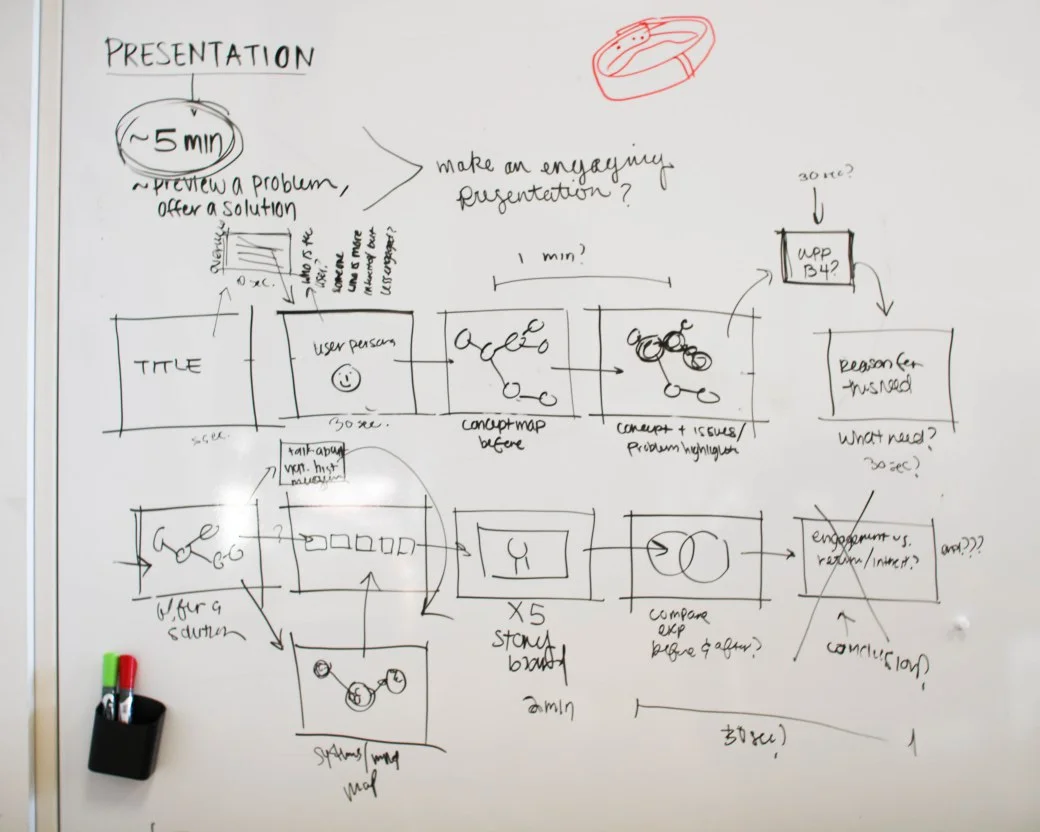
During class, we made a slide by slide diagram of what the presentation aspect itself would encompass. This task was fairly simple.
HOWEVER, throughout this process I found out that my original idea was nearly the same thing that Tiffany presented. Time for a last min switch in ideas. In studio, right before it was time to present ours as the last two, I conjured up a new idea to present.
Day 7
This new idea (final) involves both the exploration at the museum and the exploration of an artifice at the museum.
What to work on for future:
What can I do with the data gained from the tracking?
Take a look at “mind ride” -the maker registered the brainwaves of people. Are you scared or calm during this particular area? Data -> internet
Collect the data from tracking?
How can the data be used?
How to hammer out the details of the experience?
Visually explain what is going on!