communicate habits: Anyone can cook
Communications | User Research | Service Design | Collaboration

HOW CAN COOKING BECOME HABITUAL AND ENCOURAGED ON COLLEGE CAMPUSES?
Living away from home, it is many students' first time having to sustain on their own. Cooking your own food is fundamentally the healthiest and cost efficient method, however, due to hurdles such as time constraints and mindsets, cooking is often second to takeaways.
We propose a system (physical, environment, and digital) that will encourage and promote the act of cooking so that a student can slowly ease into a lifestyle that incorporates cooking.
Role & Contribution
I worked on user research, visual style, ideation, prototyping, and documentation with the team.
My major contributions are:
Leading user research
Creation of visual assets
Case prototyping
Card prototyping
Box + tag production
Deliverables
Physical Prototype, Digital Prototype, Environmental Prototype, Concept Documentation
Design Brief
Create a system of physical, digital, and environmental pieces that will promote a new habit on campus.
Team
Susie Lee, Tiffany Lai
PROCESS
Tiffany and I were partnered for this project as we were both interested in promoting cooking on campus. For me, this interest grew out of my discovery into food industry documentaries on streaming platforms such as Netflix. We began the project by brainstorming about our topic. What medium is appropriate for it? Who is our audience? Where would we implement our ideas? What ideas do we want to promote?

In order to develop a visual tone and language, we went through a series of experimenting with color and abstract imagery. Tiffany and I defined our project into six different adjectives. I defined the project in terms of experimental, growth, lively, nostalgic, calming, and adult-ing/ planned. With these words, I attempted to depict it in a visual language through colour and form. Tiffany tried to guess what my imagery depicted vice versa for hers. Between our twelve terms, we compared them in a venn diagram and found a middle ground to target our system around.

We wanted to focus more on the “healthy, active” lifestyle aspect of cooking. We discussed the direction we wanted our project to go. After mostly discussing which mediums we wanted to use, and for what reason. We ended up crossing a few off of our previous list.
We proceeded by conducting a survey in order to research about students and their campus cooking habits.

Key Insights:
Most people want to cook
The ones who said “no” are the ones who are already content with cooking for themselves.
People do not cook for the same overarching reasons:
lack of resources,
inconvenience,
laziness, and other priorities.
We also talked more about the catch, validation, and call to action. We used these to inform our designs. These are some ideas we were thinking of (for print/physical). We tackled a few of these and physically prototyping them. We physically prototyped a few of our ideas, going broad before scoping down.
Prototype 1: Modified Advertisement
Idea: A modified advertisement of a Coca-Cola can that opens up to reveal the amount of sugar and health detriments that one can of Coca-Cola contains.
Purpose: To inform. This is one tactic we were thinking about using — to inform the users of the drawbacks of consuming things that are not home-cooked. We also believed it was something both of us would pick up if we were to come across it.
Feedback: Not motivating, just cool.

Prototype 2: Recipe Card and Health Benefits
Idea: A recipe card that opens up to reveal the health benefits of a certain food (in this case, omelettes).
Purpose: To inform and to spur action.
Feedback: Overwhelming content overload.
Prototype 3: Process Video
Idea: A video informing the viewer how to make an omelette.
Purpose: To inform and to spur action.
Feedback: No different from Tasty, just a video.
Our ideas strayed too far from the message we intended on portraying. Even though we hadn't scoped down on the specific message. We definitely jumped into prototyping too quickly without thinking about the overlaying message we want, so we took a step back.
We spent some time to ourselves writing down more ideas that will make sense for our system, then got back together to discuss.
We finalized on a set of three: Ease-In Cards (physical), Bartering App (Digital), and a Pop-Up Shop (Environmental).
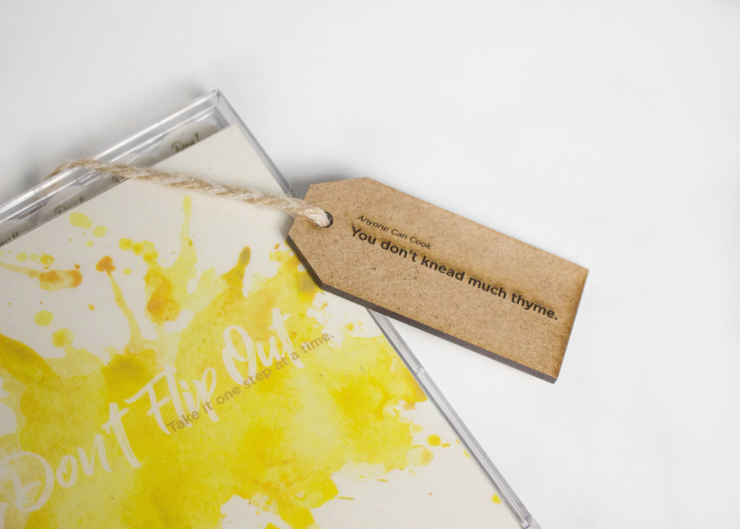
PHYSICAL: Ease- In Cards
The purpose of this collection of cards is to ease the user into a cooking lifestyle. Each card contains a simple recipe, and each corresponding card is more complex than the last.
We ran into a few problems printing, like trying to run thick paper through the printer, which resulted in distorted prints, so we stuck with a thinner cardstock-like material instead. In addition, we were also unable to create a good stencil for spray painting gold paint for the titles.
At this point, our cards’ typography was too heavy. We needed to work on hierarchy and what information we wanted on each cards’ front and back.
The Ease-In Cards come in a case, and we prototyped a case to hold the cards. We initially used chipboard and a clear plastic film. The back contained a magnetic piece that folded outwards to prop the case up into a stand.
The second prototype was created out of balsa wood and thin acrylic. Our biggest issue with that was the back stand. We couldn’t figure out an effective way to create the hinge mechanism so we used electrical tape for the time being.
For a more refined version of the case, I created a laser cut model that would stand on its own with a stand that could be flush with the back of the case. However, with our available supplies, the wood and acrylic created a product that was too thick and cumbersome for our purpose.


DIGITAL: Bartering App
The final version of the app is shown below. The screens were created in Illustrator and then the mock up was finalized on InVision.
ENVIRONMENTAL: Pop-Up Shop
The most iterative components of this portion was the laser cutting of wooden elements such as the tags and crate. The truck also uses elements of the cards, bringing back together the visual style and tone.


The tote bags were labeled with the phrase, "If You're Hungry and You Know It, Fill Your Tote"


